Harmony
Comprehensive end-to-end product design and a complete structural revamp for an advance Project Management Operating System.
Industry
Project Management
Engagement
Information architecture, Design Strategy, UX and UI Design
Design Strategy, UX and UI design
Website
Harmony
Comprehensive end-to-end product design and a complete structural revamp for an advance Project Management Operating System.
Industry
Project Management
Engagement
Information architecture, Design Strategy, UX and UI Design
Website
Harmony is a SaaS platform designed as the Business OS for professional services firms for small and medium size agencies. It helps companies manage projects, people, and profitability.
Harmony is a SaaS platform designed as the Business OS for professional services firms for small and medium size agencies. It helps companies manage projects, people, and profitability.
PROBLEM STATEMENT.
PROBLEM STATEMENT.
Professional services firms with under 150 employees struggle with fragmented tools and manual processes, leading to friction for employees, confusion for managers, and blind spots for leadership. Employees often forget how to navigate tasks or log time, managers spend hours resolving queries and approvals, and leaders lack real-time clarity on profitability. Harmony OS needed to evolve from a basic tracking tool into a system that empowers accountability, motivates employees, and gives every role - employee, manager, and founder, the clarity they need to work effectively.
Professional services firms with under 150 employees struggle with fragmented tools and manual processes, leading to friction for employees, confusion for managers, and blind spots for leadership. Employees often forget how to navigate tasks or log time, managers spend hours resolving queries and approvals, and leaders lack real-time clarity on profitability. Harmony OS needed to evolve from a basic tracking tool into a system that empowers accountability, motivates employees, and gives every role - employee, manager, and founder, the clarity they need to work effectively.
The Challenge.
The Challenge.
Harmony was facing structural experience gaps that limited product adoption and long-term engagement.
High Onboarding Friction
First-time users were overwhelmed early, causing significant drop-offs before value was realized.
Inefficient Employee Visibility
The employee directory lacked clarity in hierarchy and speed of access, slowing everyday workflows.
Fragmented Navigation
Movement across modules was unintuitive, increasing cognitive load and user confusion.
Post-Trial Retention Risk
Without a compelling end-to-end experience, user engagement declined after initial trials.
Undifferentiated Brand Experience
The product lacked a distinct visual identity, making it feel interchangeable rather than memorable.
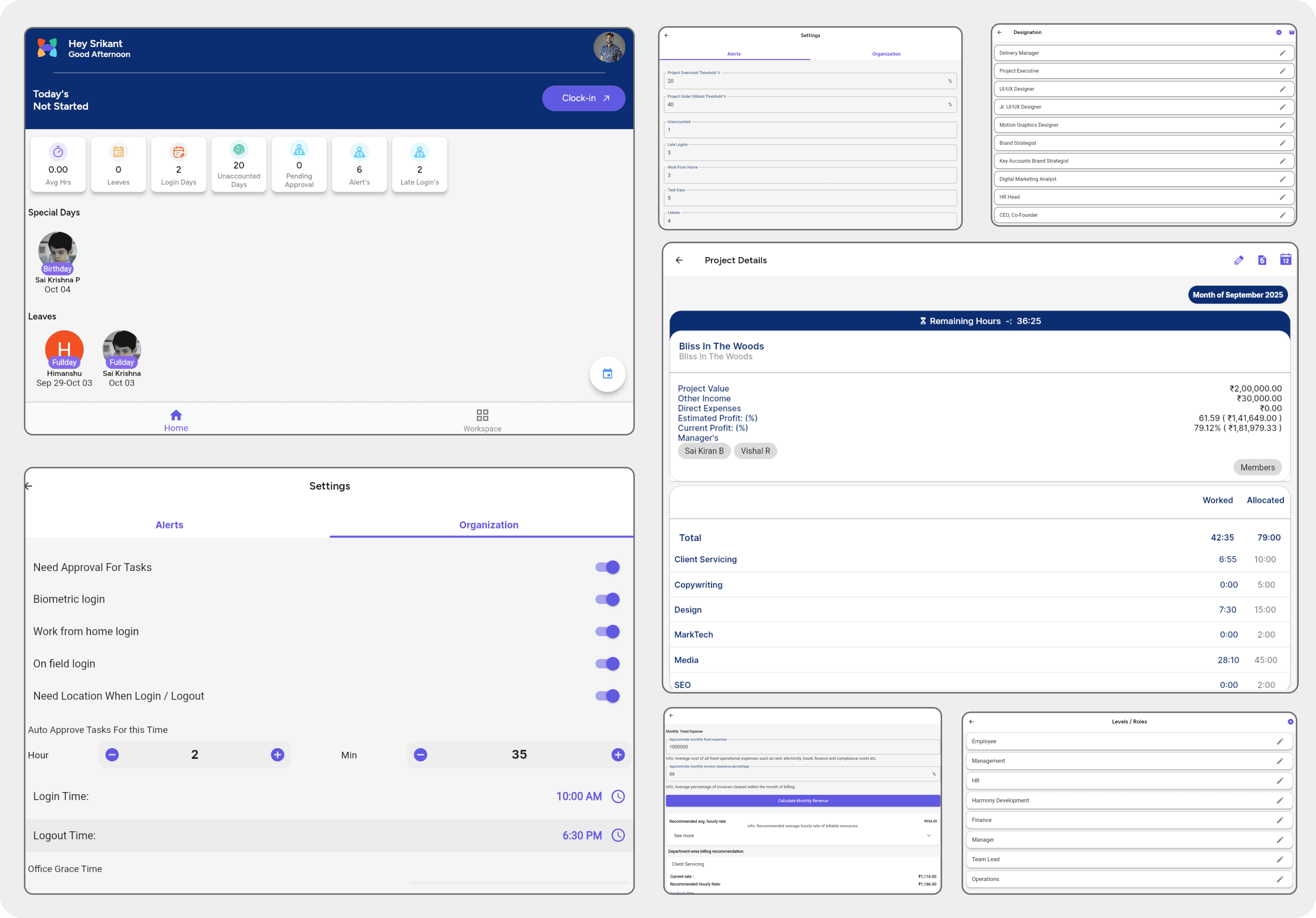
BEFORE SCREENS.
BEFORE SCREENS.
BEFORE SCREENS.
BEFORE SCREENS.
SOLUTION.
SOLUTION.
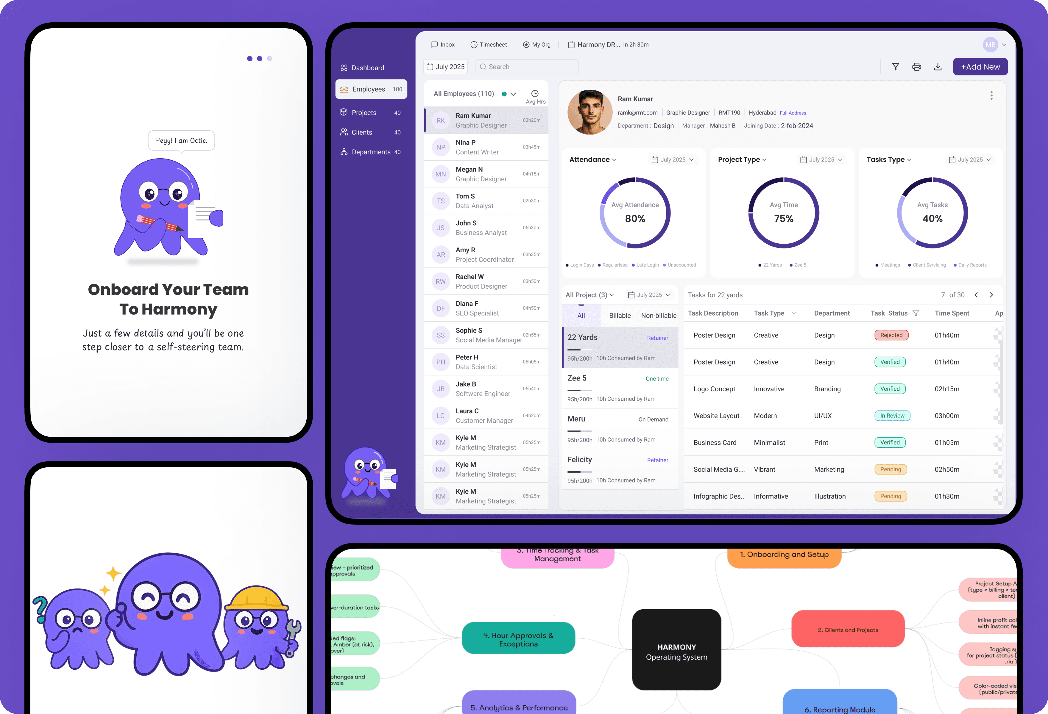
Restructured Information Architecture with Minimum Reinvention
Designed journey-based flows instead of siloed modules
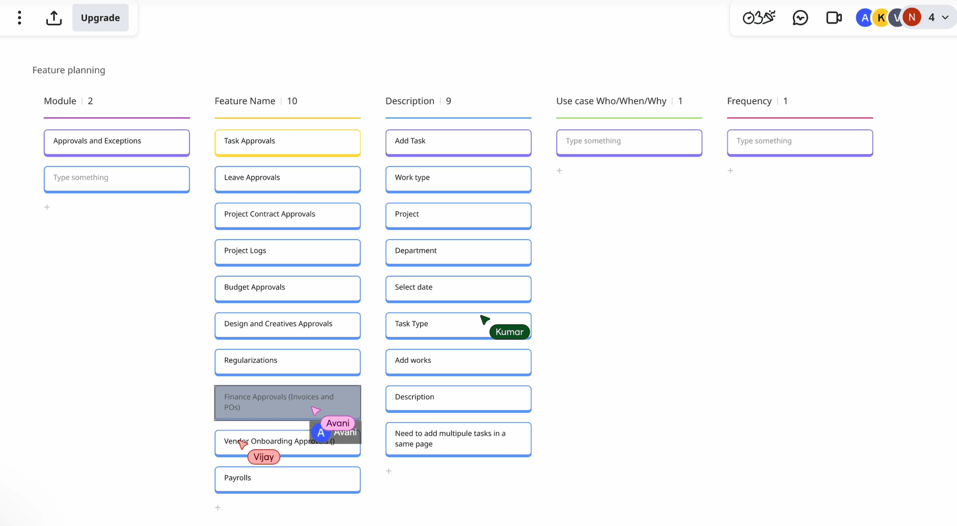
Created feature backlog with use cases per module
Introduced UX elements to motivate daily usage (mascot, day-in-review, badges)
Restructured Information Architecture with Minimum Reinvention
Designed journey-based flows instead of siloed modules
Created feature backlog with use cases per module
Introduced UX elements to motivate daily usage (mascot, day-in-review, badges)
GOAL.
GOAL.
To make Harmony feel like a productivity partner, not just another tool a system that is motivating, self-explanatory, and supportive of every role in the team.
To make Harmony feel like a productivity partner, not just another tool a system that is motivating, self-explanatory, and supportive of every role in the team.
DISCOVERY.
DISCOVERY.
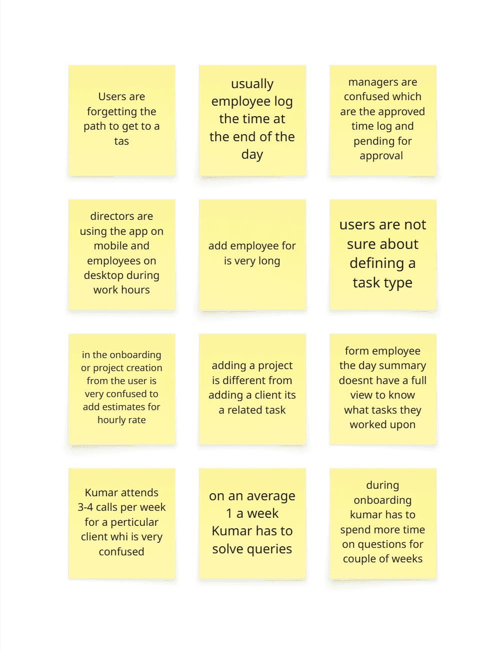
User Research Insights (Client-provided + Our Validation)
Users often forgot the path to find or log tasks
Employees usually logged time only at day-end, causing inaccuracy
Managers were confused between approved vs. pending logs
Onboarding and project creation was confusing, especially with hourly rate estimates
Adding a project felt disconnected from adding a client
Employees lacked a clear day summary of tasks worked
New joiners had to ask too many questions in the first weeks
Directors used mobile, while employees used desktop → different context needs
The Add Employee form was too long and overwhelming
Users were unsure about task type definitions
Kumar (Ops lead) spent 3–4 calls a week clarifying workflows and 1 day/week solving queries
User Research Insights (Client-provided + Our Validation)
Users often forgot the path to find or log tasks
Employees usually logged time only at day-end, causing inaccuracy
Managers were confused between approved vs. pending logs
Onboarding and project creation was confusing, especially with hourly rate estimates
Adding a project felt disconnected from adding a client
Employees lacked a clear day summary of tasks worked
New joiners had to ask too many questions in the first weeks
Directors used mobile, while employees used desktop → different context needs
The Add Employee form was too long and overwhelming
Users were unsure about task type definitions
Kumar (Ops lead) spent 3–4 calls a week clarifying workflows and 1 day/week solving queries
APPROACH & DESIGN PHILOSOPHY.
APPROACH & DESIGN PHILOSOPHY.
Making Harmony intuitive, motivating, and delightful to use every day.
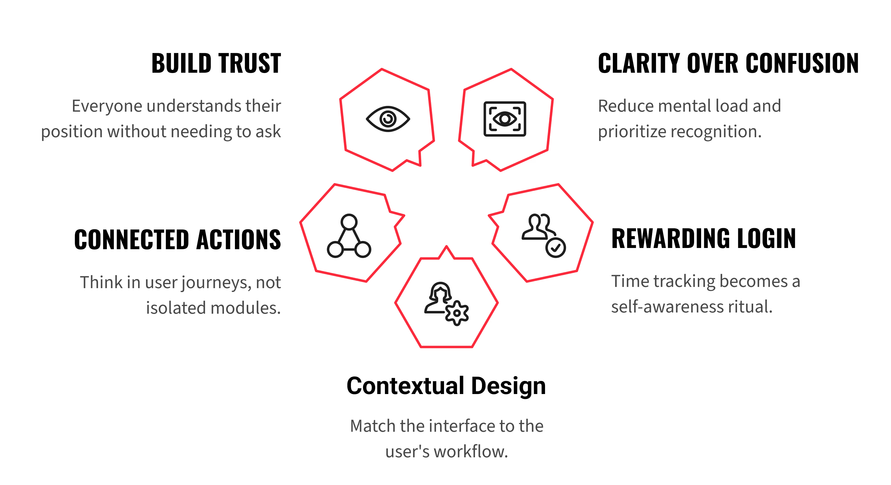
From Confusion to ClarityReduce mental load. Prioritize recognition over recall.
Make It Rewarding to Log InTurn time tracking into a self-awareness ritual, not a chore.
Design for Context & DeviceMatch interface to how each role works (Directors on mobile, teams on desktop).
Connected Actions, Not SilosThink in journeys, not modules.
Build Trust with VisibilityEveryone knows where they stand without asking.
Making Harmony intuitive, motivating, and delightful to use every day.
From Confusion to ClarityReduce mental load. Prioritize recognition over recall.
Make It Rewarding to Log InTurn time tracking into a self-awareness ritual, not a chore.
Design for Context & DeviceMatch interface to how each role works (Directors on mobile, teams on desktop).
Connected Actions, Not SilosThink in journeys, not modules.
Build Trust with VisibilityEveryone knows where they stand without asking.
OUR PROCESS.
OUR PROCESS.
1. Workshops with Stakeholders
1. Workshops with Stakeholders
We conducted collaborative workshops with Harmony’s leadership and operations team. Together, we restructured modules to reflect real workflows (client → project → task → hours → approval → reports).
We conducted collaborative workshops with Harmony’s leadership and operations team. Together, we restructured modules to reflect real workflows (client → project → task → hours → approval → reports).
1.1 Feature Mapping
1.1 Feature Mapping
We ran feature-mapping exercises, prioritizing by:
User pain-points
Business criticality
Scalability
We ran feature-mapping exercises, prioritizing by:
User pain-points
Business criticality
Scalability
1.2 Module Restructure
1.2 Module Restructure
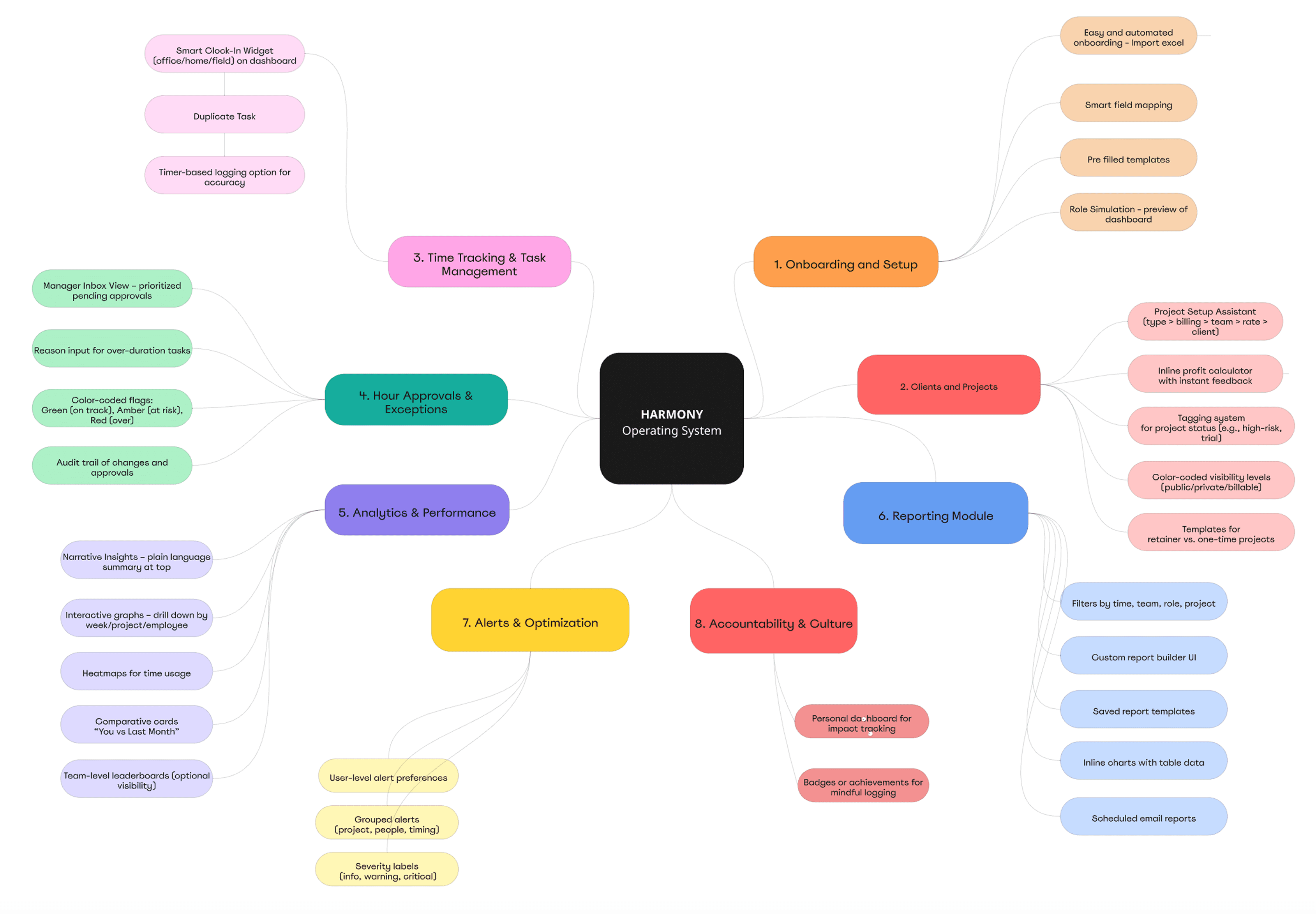
Instead of reinventing, we streamlined existing modules with minimum disruption:
Onboarding & Setup: Guided flows, role simulation, smart defaults
Clients & Projects: Unified client+project creation, inline profit calculator
Time & Task Management: Smart clock-in widget, day summary, operational vs project prompts
Approvals & Exceptions: Manager inbox, color-coded flags, audit trail
Analytics & Performance: Narrative insights, heatmaps, comparative cards
Reports: Filters, saved templates, scheduled reports
Alerts & Optimisation: Smart nudges, severity-based alerts
Accountability & Culture: Badges, recognition nudges, personal impact dashboard
Instead of reinventing, we streamlined existing modules with minimum disruption:
Onboarding & Setup: Guided flows, role simulation, smart defaults
Clients & Projects: Unified client+project creation, inline profit calculator
Time & Task Management: Smart clock-in widget, day summary, operational vs project prompts
Approvals & Exceptions: Manager inbox, color-coded flags, audit trail
Analytics & Performance: Narrative insights, heatmaps, comparative cards
Reports: Filters, saved templates, scheduled reports
Alerts & Optimisation: Smart nudges, severity-based alerts
Accountability & Culture: Badges, recognition nudges, personal impact dashboard
MEET OCTIE.
MEET OCTIE.
MEET OCTIE.
MEET OCTIE.
Motivating daily usage
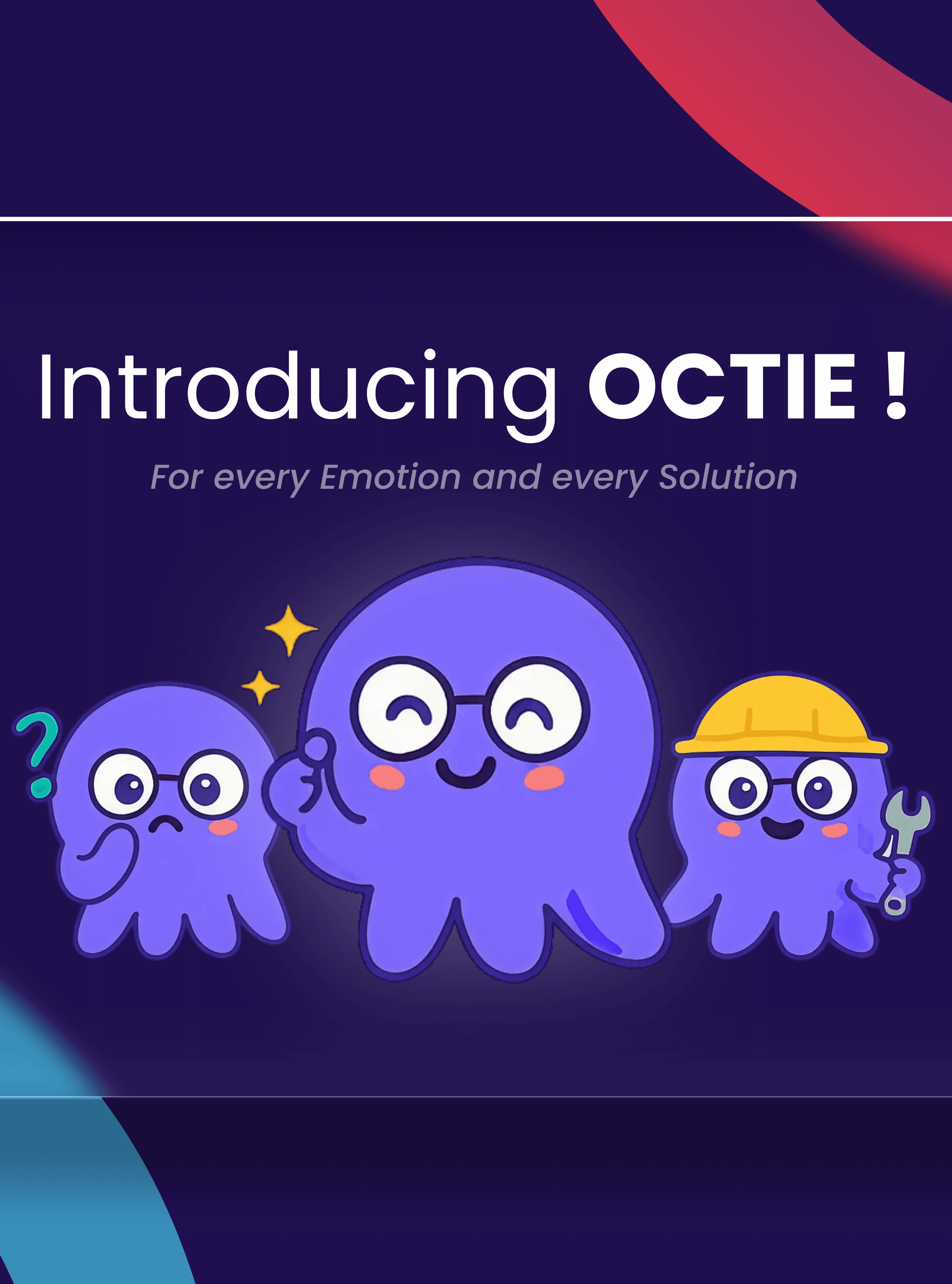
To make Harmony to a recognizable identity that builds user trust and delight. more approachable, we designed Octie, an octopus mascot.
Motivating daily usage
To make Harmony to a recognizable identity that builds user trust and delight. more approachable, we designed Octie, an octopus mascot.
Why an octopus?
Why an octopus?
Eight arms = multitasking, balance, support → fits the idea of managing projects, people, and profitability.
Ocean / fluid metaphor → flexibility, adaptability, and calmness in complexity.
Friendly guide → not a manager, but a partner that nudges and motivates.
Eight arms = multitasking, balance, support → fits the idea of managing projects, people, and profitability.
Ocean / fluid metaphor → flexibility, adaptability, and calmness in complexity.
Friendly guide → not a manager, but a partner that nudges and motivates.
Octie’s Core Expressions
Octie’s Core Expressions
Cheerful / Celebrating → when user completes tasks, logs time on time, or wraps up the week.
Encouraging → when nudging to log time or review pending tasks.
Curious / Thinking → when helping clarify confusing steps (like task type or hourly rate setup).
Supportive → when approvals or tricky actions are needed (“I’ve got you, let’s do this together”).
Confident / Secure → during sign-in, approvals, or audit-related flows..
Cheerful / Celebrating → when user completes tasks, logs time on time, or wraps up the week.
Encouraging → when nudging to log time or review pending tasks.
Curious / Thinking → when helping clarify confusing steps (like task type or hourly rate setup).
Supportive → when approvals or tricky actions are needed (“I’ve got you, let’s do this together”).
Confident / Secure → during sign-in, approvals, or audit-related flows..
Impact
Impact
Octie humanized the product, making it more engaging and approachable, which contributed to higher user retention.
Octie humanized the product, making it more engaging and approachable, which contributed to higher user retention.
PRODUCT DESIGN.
PRODUCT DESIGN.
The core focus of our design approach was simple: minimize the time spent on the app while maximizing the outcomes. Harmony needed to feel fast, intuitive, and motivating a tool employees wouldn’t resist logging into, and leaders could trust for clarity. Our design principles were:
Quick Navigation: Reduce clicks, simplify flows, and surface the most-used actions upfront.
Scalable & Familiar Layout: Leverage design patterns users already know, while building a foundation that scales with new modules.
Reusable Components: Build consistency across modules with shared layouts, widgets, and input styles.
Data Clarity: Give management precise insights without overwhelming detail.
Role-Based Outcomes: Employees → clear view of tasks and performance Managers → approval and utilization clarity Founders/CEOs → profitability visibility
The core focus of our design approach was simple: minimize the time spent on the app while maximizing the outcomes. Harmony needed to feel fast, intuitive, and motivating a tool employees wouldn’t resist logging into, and leaders could trust for clarity. Our design principles were:
Quick Navigation: Reduce clicks, simplify flows, and surface the most-used actions upfront.
Scalable & Familiar Layout: Leverage design patterns users already know, while building a foundation that scales with new modules.
Reusable Components: Build consistency across modules with shared layouts, widgets, and input styles.
Data Clarity: Give management precise insights without overwhelming detail.
Role-Based Outcomes: Employees → clear view of tasks and performance Managers → approval and utilization clarity Founders/CEOs → profitability visibility
The core focus of our design approach was simple: minimize the time spent on the app while maximizing the outcomes. Harmony needed to feel fast, intuitive, and motivating a tool employees wouldn’t resist logging into, and leaders could trust for clarity. Our design principles were:
Quick Navigation: Reduce clicks, simplify flows, and surface the most-used actions upfront.
Scalable & Familiar Layout: Leverage design patterns users already know, while building a foundation that scales with new modules.
Reusable Components: Build consistency across modules with shared layouts, widgets, and input styles.
Data Clarity: Give management precise insights without overwhelming detail.
Role-Based Outcomes: Employees → clear view of tasks and performance Managers → approval and utilization clarity Founders/CEOs → profitability visibility
MEASURABLE OUTCOMES.
MEASURABLE OUTCOMES.
Onboarding time reduced from weeks of Excel setup → guided flow in minutes
Managers saving up to 1 day per week previously spent resolving task/logging queries
Time logs more accurate and timely, improving billing precision
Leadership reporting moved from retrospective correction → proactive insights
Onboarding time reduced from weeks of Excel setup → guided flow in minutes
Managers saving up to 1 day per week previously spent resolving task/logging queries
Time logs more accurate and timely, improving billing precision
Leadership reporting moved from retrospective correction → proactive insights
LEARNINGS.
LEARNINGS.
Balancing minimum reinvention with maximum clarity can be more effective than pushing radical redesigns. A clear feature mapping exercise upfront ensures teams stay focused on what solves real user pain points. Building in cultural elements (like Octie the mascot, badges, nudges) can make even operational tools feel human and motivating.
Balancing minimum reinvention with maximum clarity can be more effective than pushing radical redesigns. A clear feature mapping exercise upfront ensures teams stay focused on what solves real user pain points. Building in cultural elements (like Octie the mascot, badges, nudges) can make even operational tools feel human and motivating.
KEY UX IMPROVEMENTS.
KEY UX IMPROVEMENTS.
This streamlined approach turned a messy, multi-step setup into a clear, logical journey making it easier for managers to create projects confidently while giving leadership accurate profitability estimates. The redesign transformed Harmony into a platform where each module reinforces the other, making accountability and productivity flow naturally.
This streamlined approach turned a messy, multi-step setup into a clear, logical journey making it easier for managers to create projects confidently while giving leadership accurate profitability estimates. The redesign transformed Harmony into a platform where each module reinforces the other, making accountability and productivity flow naturally.
WHAT OUR CLIENTS SAY.
WHAT OUR CLIENTS SAY.
WHAT OUR CLIENTS SAY.
Hear directly from our clients as they share their success stories and experiences stories we’re proud to have been a part of.
Hear directly from our clients as they share their success stories and experiences stories we’re proud to have been a part of.
Hear directly from our clients as they share their success stories and experiences stories we’re proud to have been a part of.
Working with Neelam and the Upsimpl team truly helped us reimagine our platform from the ground up. Their research-driven approach to UX opened our eyes to insights we hadn’t considered before.
Salil Kale
Kumbh Technologies
Working with Neelam and the Upsimpl team truly helped us reimagine our platform from the ground up. Their research-driven approach to UX opened our eyes to insights we hadn’t considered before.
Salil Kale
Kumbh Technologies
OUR VALUES.
OUR VALUES.
Our mindset is built on core values, simple yet essential for a seamless and effective workflow.
Our mindset is built on core values, simple yet essential for a seamless and effective workflow.
Our mindset is built on core values, simple yet essential for a seamless and effective workflow.
01
Think like humans
Humans are at the heart of our work. Simply put we create for people, with people.
01
Think like humans
Humans are at the heart of our work. Simply put we create for people, with people.
02
Design purposefully
We design with purpose, focusing on the real impact a product has on business growth. It’s not just about aesthetics it’s about efficiency, strategy, and profitability.
02
Design purposefully
We design with purpose, focusing on the real impact a product has on business growth. It’s not just about aesthetics it’s about efficiency, strategy, and profitability.
03
Build lasting relationships
We value authenticity and have zero tolerance for fluff. We’re honest, open, and direct because we respect your business and hold ourselves to high standards too. That’s the foundation of any successful partnership, isn’t it?
03
Build lasting relationships
We value authenticity and have zero tolerance for fluff. We’re honest, open, and direct because we respect your business and hold ourselves to high standards too. That’s the foundation of any successful partnership, isn’t it?
Not sure where to start?
Not sure where to start?
Not sure where to start?
We'll help you identify the biggest gap in your product.
We'll help you identify the biggest gap in your product.
Let's Connect
Upsimpl All rights reserved.